Posted on
A little bump on the clown car
In this post I'm going to outline the effort, and see what are the pros and cons of using the Clown Car Technique to solve one of the biggest problems of the RWI , i.e. serve, with only one tag, more than one image depending on the media breakpoint.
Since it's been introduced less than a year ago, we've been hesitant and excited to see if we could implement the Clown Car Technique.
In the last few months we finally gave it a go, on our company's website.
If you haven't heard of it before, I can forewarn you that it's not as easy to implement as it is cool. In other words this could be done only when having complete control over the outputted markup and the generated images, something that wouldn't be possible or would have taken ages to implement with many pre-built CMS applications.
The technique is indeed clever and seems to cover any and every case without problems, by leveraging on the native fallback provided by the <object> tag, as highlighted in the Smashing Magazine's article.
Further to be considered is that, once you've packaged your images, created the SVG with the right rules, embedded it within the object, you need to place it somewhere and style it accordingly.
Actual implementation
Since we're working within the RWD realm, we will need to remove any reference to the actual size of the objects we're displaying in our page and let them scale as the viewport/display-size/resolution changes.
Technically the <object> (or the wrapping element) needs to have either different fixed dimensions or scale automatically.
You will end up with some code that will resemble the example I've published on codepen myself (nothing fancy, literally exactly what you learn from the article, plus some CSS classes):
This is all good and fantastic.
Doing some real world testing
Before we managed to send out the code to production we started doing some proper device testing and what we've found to our greatest surprise is that, although effectively all the latest well-known devices support it fantastically, some specific version of WebKit had some unexpected problems as you can see by the following image:
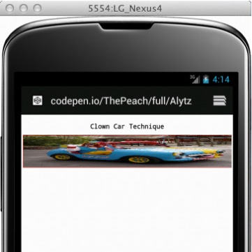
The problem seems to be related to specific versions of WebKit.
Why this is happening, I don't know. At least we couldn't find any reasonable or related bug report that could explain it.
Essentially the problem is due to a miscalculation of the height of the image when using a flexible width container, which causes the browser to miscalculate the ratio. Pretty badly.
This problem does not happen - kinda obviously - when using fixed size images.
To mitigate the problem, before implementing a more solid approach, even if still temporary until the RWI problem is solved, we've added a very small script that targets the specific versions of WebKit we've found it on that fixes the height of the object container.
What to take from all this?
Well, first and foremost:
know your target users
Also have a proper strategy in dealing with technologies and browsers , decide your three tiers of support and move on from there.
Secondly, each feature needs to weigh the cool factor with the effort, which is both in implementing it and maintaining it.
We've got tricked by the cool factor, but it's been good as we've learnt something new. The downside is that implementing it is a bit of a hassle, maybe maintaining it is not.
After all these considerations - although it might sound silly, we miss it already, especially when fetching DOM snippets via AJAX where the images should be of the right dimension for the device.
Of course if your strategy is sound and doesn't expect an almost-complete browser support, this technique is still valid, for all the others, you just have to sit and hope a proposal will get accepted, evaluated, implemented and shipped on all the browsers.