Posted on
Hurdles and joys of building a style guide
In my previous article, “CSS architectures for UI developers” I've tried to express how complicated is the situation surrounding the ideation, creation, and management of design systems for the web.
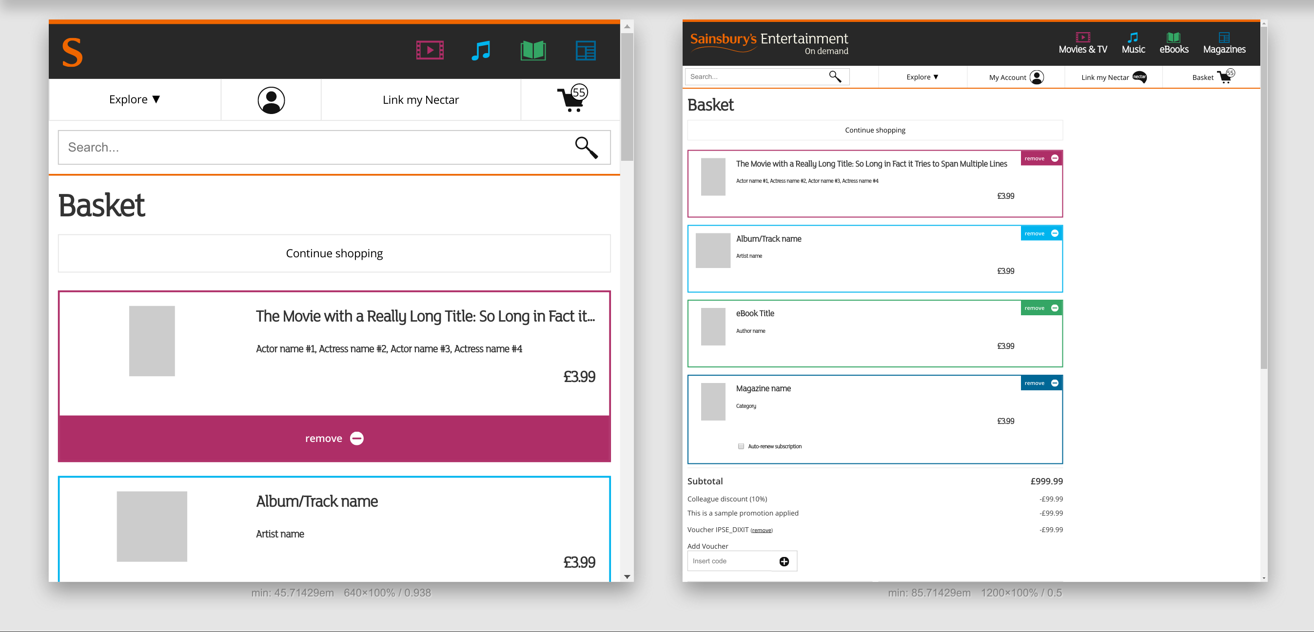
I worked with Atomic Design and the PatternLab tool on at least 3 major projects, most notably during my period at Sainsbury’s in introducing and creating from scratch the style guide for the now defunct Sainsbury’s Entertainment on Demand, helped the Groceries Online team in getting their own style guide sorted, and supervised as a technical advisor the initial creation of the global Sainsbury’s style guide, project Luna.
In this article, I’d like to highlight some of the problems we solved in using a pattern library, and more importantly, some of the problems I’ve encountered in the first of these projects, by creating a pattern library for a legacy project.
Introducing a pattern library
It goes without a doubt that having a blank canvas where you can draw whatever you want is the dream, but when it comes to engineering and design this is rarely the case: we always have to work on someone else’s work, and pick up from mistakes and over-engineered solutions.
This was the instance when I joined Sainsbury’s Entertainment on Demand at the beginning of 2015.
The situation I was faced with was the following:
- The website was holding - at the time, only e-books together with a more generic user section, and it would have soon hosted e-magazines and digital music.
- There was an overall brand plastered together, something that was more of an imposition of the main Sainsbury’s brand over something that was created previously, so it was clear they already undergo several design iterations.
- Responsiveness was achieved with a desktop-first approach, with little to no idea of what UX meant or what it could mean for the user.
- On the technical side, Bootstrap was being used as a base framework, which it had been extended and overridden many times in order to obtain the actual look and feel. I won’t get into details on why using Bootstrap is not a good idea for a large website, but just to make it clear, both the markup and the CSS were a real mess, and the time to implement or fix anything had already doubled if not tripled.
Overall, the designers, the developers, and the business had no idea of what a pattern library meant or what could help them achieve.
Introducing a pattern library at this stage could have been particularly difficult, and I had to go through some steps before I could even think of having one.
Step #1: clear up the mess
As a generic mantra for any legacy project, we can safely say that before writing new code, you need to put the old code in a good-enough shape that will allow you to have a solid base and allow developers to write code in a consistent way.
You need a solid base if you want to make sure any of the work you’re going to do is not going to fall on yourself later on, essentially by creating trust on it.
Using scss-lint has been the best choice for that, as it enforced a specific way of writing, organising the modules, and defining a clear structure for them and the types of rules allowed. Right now I would pick StyleLint as it would avoid depending on ruby gems at all and a better configuration, and other reasons as stated in the above page of scss-lint.
Linting is not the only answer for clearing the mess, but it helps a great deal: this step alone is something that took a good couple of sprints to tackle.
The main issues I’ve found were usually around these areas:
- Naming conventions: either by not having any or by loosely following one, like BEM. “How many dashes/underscores? There is a nesting rule for elements!?”
- Overall architecture: the breakdown of the components and their organisation shouldn’t be left to a last-minute decision: picking a simple enough file organisation and overall architecture is important to build a good design system.
- Typography: this was very much another pain point, with no vertical rhythm and modular scale in place, typesetting was based purely on a case by case situation.
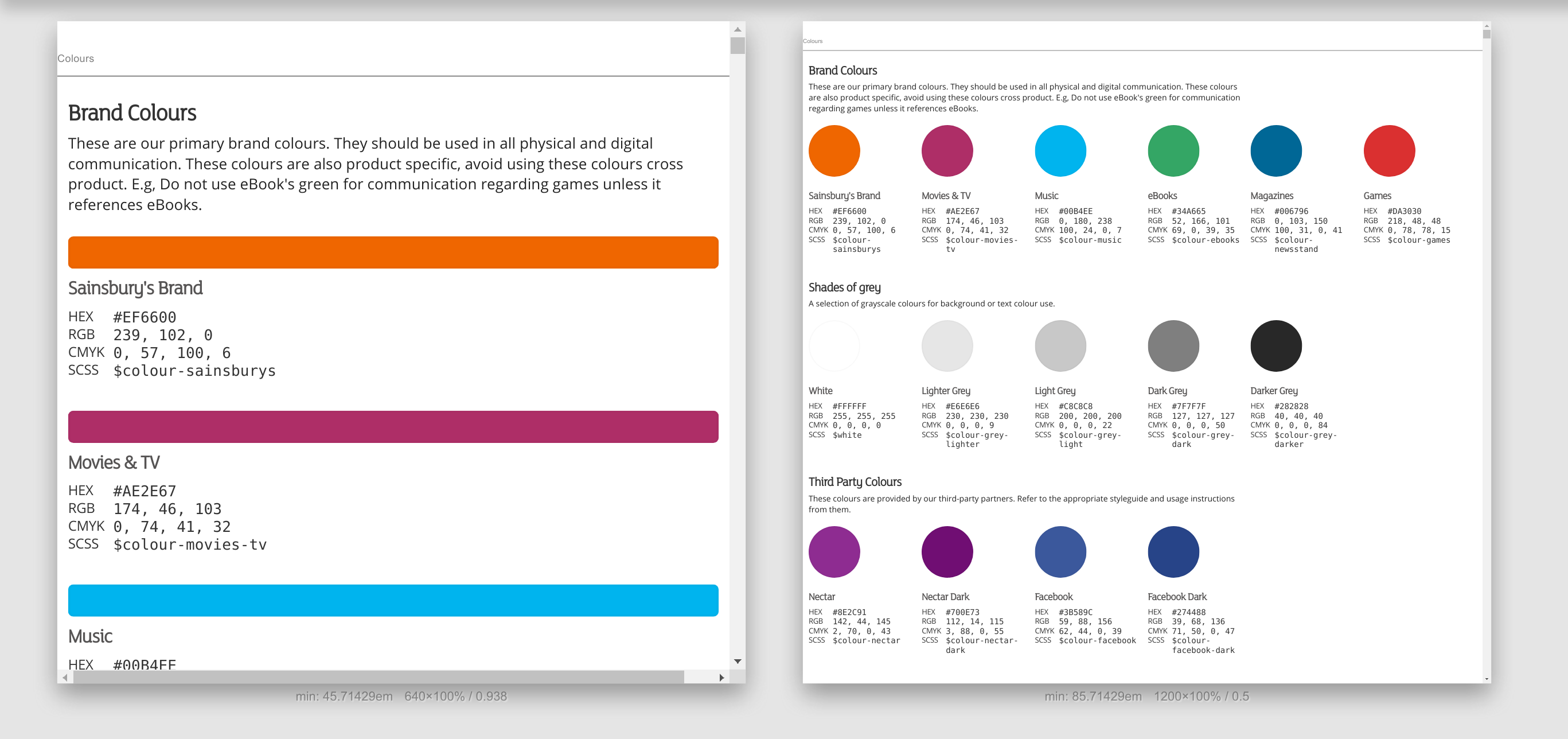
- Various code smells: in particular the use of variables or lack thereof. We had to collect all magic numbers spread across the code and make sense of them, we ended up finding 14 different breakpoint media queries and more than 50 different colours. We managed to bring them down to 6 and 25 respectively, it might not seem much but it helped a lot.
Step #2: define a new way of working
Writing code is never enough: there’s a lot that needs to be done that will enable you to just do that and remove much the background noise. I’ve written about it before from a higher perspective, but in the context of implementing style guides, there are two basic steps we took that seemed to work.The basic idea is to implement the UI elements before anything can be done, in other words, we ended up splitting up the UI creation and the integration of these elements. This might not always be the solution, but it worked well for us as it gave us the time to have the sign-off from the business and ensure things were done correctly, by also fixing any additional issue we might have encountered. Generically we were trying to get things ready to integrated at least one sprint before, but sometimes we had to include the work within the same sprint which worked OK once we were all used to that.
The other part needed, was a much bigger effort in analysing the piece of UI we needed to implement, for us it was mostly due to the design resources we had at hand and the integration with the current system, and breakdown due to the architecture we chose (Atomic Design).
The big drawback from this is that whoever implements the UI needs to be aware of the underlying system, so doing the breakdown analysis with the whole team is quite key as it can expose problems and inconsistencies in a better and more consistent way: always keep in mind that there is so much you can digest each sprint, so overloading your analysis with too many items might not be a good idea, and maybe spreading it throughout the sprint could help you get there with more ease.
Step #3: the plan
Replacing a pre-existing stylesheet with a brand new one with new rules can probably be done if your markup is clean enough: the lack of attention when choosing (if at all) any methodology can prove to be extremely draining and will make you hate everything you’re doing.In our scenario, that’s exactly what happened: we couldn’t justify the investment of resources to spend months in developing a whole new style guide and swap it off with some sort of big-bang release.
This doesn’t work, and will most likely have underestimated knock-off effects: we decided to take the opportunity of the new product section for Music to introduce the style guide and showcase it to the rest of the development team and the stakeholders after the first MVP. This meant that the efforts for building the components were very much contained and we could focus on solving the aforementioned problems.
In order to get us there we had to work out the best way to address this challenge:
- Create a pattern library exclusively with new elements: these should be created with the idea of maximum future reusability, with common grid molecules and basic atoms.
- Make sure the overlapping of the new style guide with the pre-existing one doesn’t lead to any name clash or any other type of issue.
- Bring the minimum amount of styles from the old stylesheet in line with the new one so that the differences are going to be minimal.
As you can probably imagine the biggest issue was #2, as we couldn’t touch the header or the footer as of yet, nor any common page, like the user library, that was already in use by the other product sections, but at the same time we wanted to start using any new molecule whenever possible.
For this reason we introduced two specific stylesheets: blame and reset.
Naming aside, the first one addressed selector styles that had to be corrected in the old stylesheet to fix some of the rules because they were either badly chosen or implemented (hence the name blame), this file used selectors specific to the old stylesheet only.
The second one was resetting some of the generic selectors that were introduced in the original stylesheet that we needed to nullify in order to bring them to an actual reset state.
Both these styles were meant to be removed once the transition was over and would help us keep things clear and separated.
Step #4: profit
At this point we had the biggest hurdles tackled, the physical work of lift and shift was started and it was well underway: now it was time to understand if the project was going to stay afloat or sink without even seeing open sea.I will keep on repeating this until exhaustion:
There is never an end to learning and educating.
For us it meant:
- Introduce the style guide to the wider public: business, stakeholders, other developers, testers, and designers: everybody should understand the tool and have confidence that this is a necessary step to support the business and ensure its long-term success.
- Involve people at any given moment, secluding ourselves would have had unexpected drawbacks: for this, we needed to release and showcase as often as possible. Without that nobody will ever know that work is underway and its level of quality.
In practical terms: the style guide ended up having two public (albeit internal) URLs and having its own pipeline with continuous integration and deployment process.
I wanted to treat the style guide as an open source project: anybody could contribute at any point, while we would have needed to have some safeguards when raising the PRs, and keeping a strict eye in ensuring backward compatibility, by using KSS documentation, deprecated notations and change logs as a very basic step: any change on the markup had to be noted down so that we could raise the appropriate tickets on the legacy platform when releasing a new version.
Where did we go from there
After the release of the Music platform, we had several challenges to overcome which influenced almost naturally the way the style guide was going to be used and developed, giving it, even more, autonomy, which meant it was packaged as an NPM module, with the ability to extend its SASS files, compile/include only the ones necessary, but as well just take the compressed and minified CSS for rapid mockups and anything else.Before operations had been halted, we had the opportunity to work on an onboarding application for the UK customer base for the e-reader Kobo, the modularisation of the legacy user interface, by splitting the checkout process in a separate UX journey and starting the work for the MVP for the Videos section.
As we had already done the heaviest of the work, introducing new elements proved to be particularly easy, and we could concentrate exclusively on the actual code.
Some additional pain points and notes
Throughout this whole process the biggest issue that myself and many other people I've talked to have found has been the steep learning curve and the absolute need to never expect people to understand what's going on.OK, let me rephrase: if you think someone has understood how the style guide works, what its benefits are, and the requirements around the process, be prepared to go through that again, over and over.
Never assume, always ask.
In this specific case the initial effort to introduce the style guide ended up being enormous, but there have been a lot of things that we have learnt in the process. The effort is not just in developing the style guide, but in educating and modifying a - probably - already established process.
“Is it worth it?”, you may ask at this point: my answer is a decisive “yes”, and the more you get people on your side the smoother the transition is going to be.