Posted on
Building the Buildit Website
Another website, another time to take a look at the journey to build one.
In this article, I'll recount the whole journey we, a dedicated team of professionals within the Buildit group of Wipro Digital, decided to tackle.
The Buildit website is not just another website as many could foolishly think; this is a test of the time, this is us trying to achieve as much as we possibly could in whatever amount of time we could use.
For many, this seems to have taken too much and too long to deliver, but we tried numerous technologies, methodologies, and did a lot of R&D while we were at it. While aiming to release a high-quality product, we tried to strike a balance between spending time improving things and actually getting things out of the door in the most agile way.
Again?
A good number of non-product companies I've worked with considered, even if silently, their website as a waste of time and resources. I've never heard anyone thinking that building the company's website was an investment for their clients, for differentiating against their possible competitors, for their possible customers, and potential candidates. For as much this sounds like crazy, the unfortunate reality forces more often than never, a single person to work on something with unrealistic deadlines, and with tools that help realise something that's hardly maintainable.
The Buildit website hasn't been different before: an effort put together just to get something out. This time we had in our hands the possibility to change things for the better, orchestrate an effort together to investigate who benefits from this website, and what would be the best content strategy for it.
Getting ready to work on this project also meant getting a few initial things together: a project like this can very well suffer from scope creep, which meant that getting a vision was the most important thing before starting.
A team with a vision
The kick-off meeting was a 2-day meeting where the major stakeholders were involved: our studio lead, a couple of delivery leads, a creative technologist lead, and me as the front-end lead.
As it usually happens, people's availability at the time defined the initial core team:
- a delivery lead (Zane Cunningham)
- a lead creative technologist (James Nash)
- a lead front-end (me)
We appointed a Product Owner, but unfortunately, we ended up short of that due to their busy schedule, so we leveraged as we went along on whomever we saw fit to play the part of the PO/stakeholder, mostly from people within the team itself. This lack probably played the most controversial part in the whole story.
If you were going through something similar, I'd like to stress that having a PO means a lot for the team, as it plays a crucial part in steering the work and prioritising the work to do. The developers have too much of an involvement in the process, and they are biased.
As we moved into a more advanced phase of the development, and with a larger team, we all shared the responsibility of pushing things forward with proactiveness, we found the lack of (micro)management and external pressure to be extremely productive for the whole team.
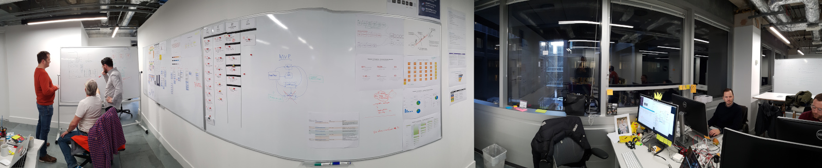
On top of that, what we also managed to do during the initial kick-off meeting was the ability to define our target users and their groups, by iterating over a series of questions and discussions, and through that, understand their supposed needs, hence the vision:
For candidates, "buildsters", clients and the community, who want to learn who we are, what we do, how we do it, and how to contact us, the Buildit website is a centralised hub for information and knowledge that tells our story with integrity. Unlike the rest of the eco-system, our website demonstrates our capability at the intersection of strategy, design and technology.
Having an overall vision has been our driving factor for most of the time we worked on various features for the MVP, as we would validate some of the steps and decisions against it.
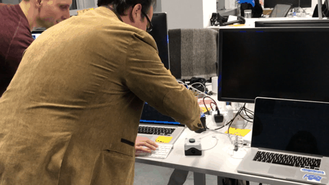
As we progressed through the development of the website, we found ourself aided by some recent hires, such as Daniel Bull, Patrick Bower, and James Mcmillan, as creative technologists, and as front-end developers, Valerio Francescangeli, Zarmineh Najiballah and Ana Escontrela, the last two as junior devs.
We also had Lorenzo Nicora and Brodie McIntyre experience as Platform Engineers helping us getting everything online.
Working on such a project allowed getting people introduced into the ways of working together, our standards and, last but not least, test our Gravity Design System in the real world.
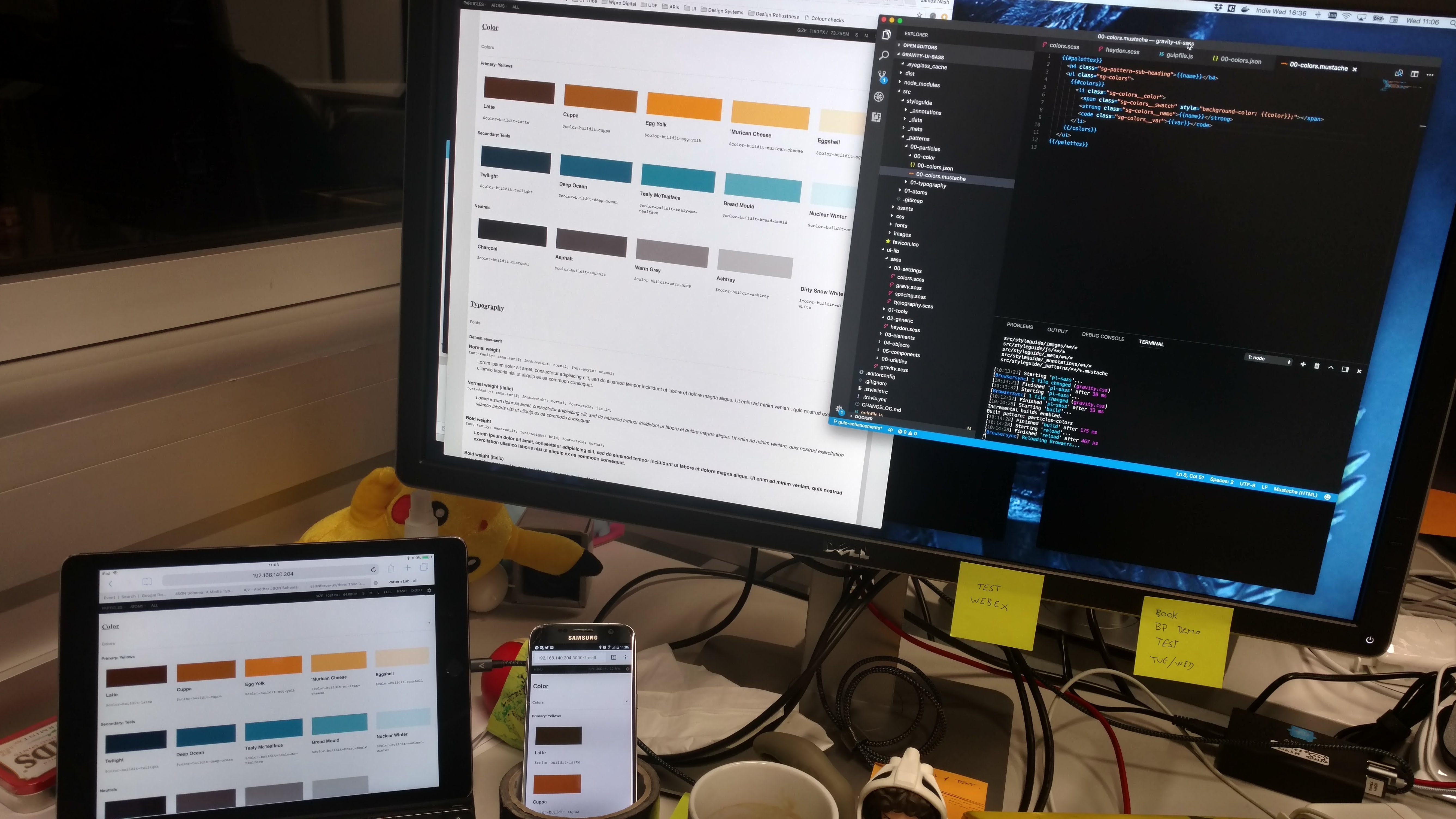
Introducing Gravity design system
If you've been following along the work that is boiling here between James Nash, Marcos Peebles, and me, a design system should have had to play some sort of part in this picture. Not because it had to, but based on direct and indirect observations, we see great value in elaborating some design language and pattern library that we can use to promote our internal work, being it physical or purely conceptual like blog posts or client's proposals.
Gravity, Buildit's design system, has been silently in the works for quite a while before we started looking into the website. We had much groundwork done for it already but lacked a supporting project we could use for soft-proofing it.
We decided to invest all the UI and UX work towards Gravity, that would have the website as the only "client", and see where it goes.
Start small, validate, and iterate.
We did want to do what we preached, so we did. It was a bumpy road, but wholly satisfying at the end.
If you want to read more about it, James recently published an article, Introducing Buildit’s Gravity design system, that dwelves into the technicalities of it.
Delivery
This project has been so far one of the best examples of working with agility (rather than being Agile, as business and marketing idiocracy has unfortunately appropriated themselves of the term).
We used a Kanban board, although we had no real interest into having WIP limits so far, nor having a CWD and approached the whole thing using what Mike Rother calls Toyota Kata.
Once we started exploring the project and uncovering the initial assumptions around the target users and we started preparing for a proper user testing session, we started identifying three main streams of work:
- UX
- Brand and visual identity
- Platform and pipeline (Tech)
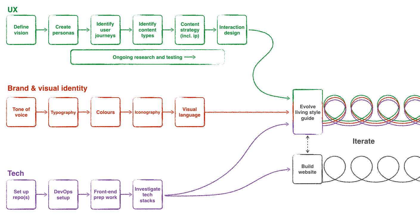
Identifying these three different streams allowed us to progress without dependencies. We were also aware that once we had sorted the majority of the preparatory work, we would have needed to join them and progress in a more traditional way.
We identified this first milestone with the publication of the style guide and the official opening of the work within it.
The subsequent milestones that we uncovered as we progressed were the initial MVP prototype, and the go-live, which I'm going to quickly go through from a delivery standpoint.
### UX
The UX discovery phase was the most important one we had to work on. We allowed ourselves to gather as much relevant data as we needed, research into various techniques to validate our current and future work, and how to collate all of this to progress further.
The research played a crucial role, and went pretty much along the lines of:
- Identify the target users and their category group, through the means of informal interviews, and data analytics
- Define the needs and requirements for each group, initially done with the definition of the personas
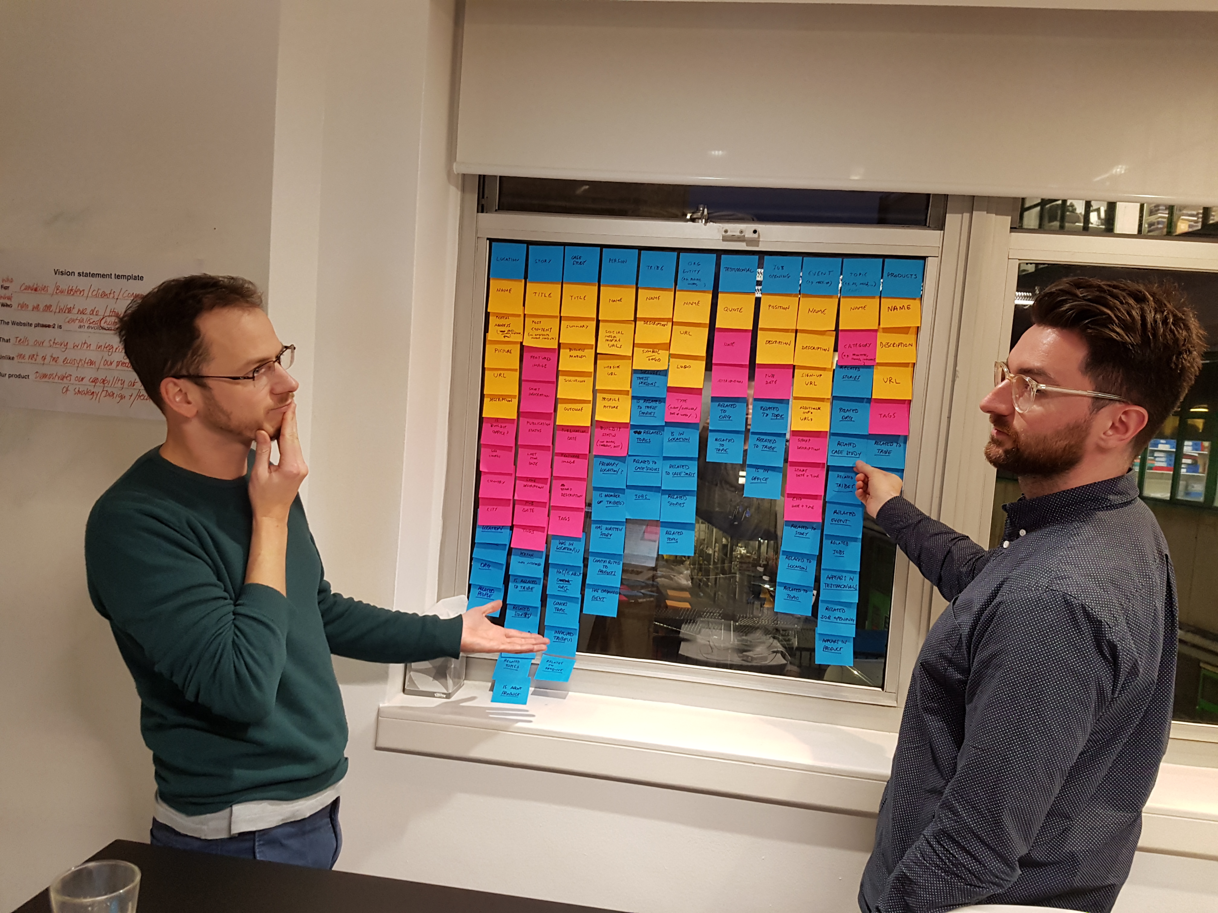
Once we made this initial step, we started modelling our assumptions using Object Oriented UX which brought us to a very interesting content organisation and structure. We validated this final model with a very rough prototype and a brief user testing session.
What came out of that was a very convincing structure that gave us an idea of a (potential) fully fledged website with a rich user experience and discovery graph.
The last bit of the puzzle meant coming up with a decent content strategy which, due to its inherent nature, intersected with the brand and visual identity.
Brand
For the work on brand and visual identity, we had to play with a lot of limitations that come with being part of a group within Wipro Digital. This meant that the logo was fixed. Anything else we had to validate and solidify. Whether this will stay the same, we're not sure, but so far this is what we had to work with.
I've used the tone of voice as the primary stepping stone to base this on, and from it derived the colour palette, intersecting it with the market research on the competitor's brands and websites.
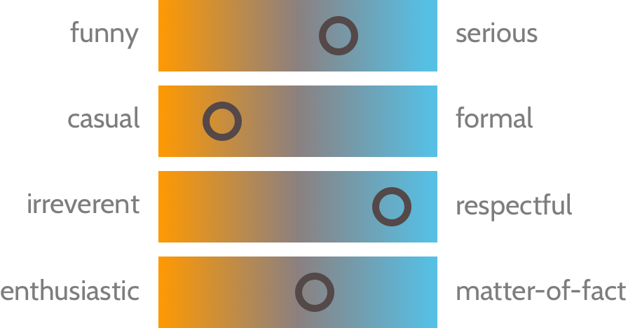
The Norman Nielsen group did an interesting analysis on the tone of voice and identified 37 website-specific tone words, and by refining the list they narrowed it down to 4 primary tone-of-voice dimensions, that can be summarised as follows:
- Funny vs. serious: Is the writer trying to be humorous? Or is the subject approached in a serious way? (Note that for our purposes, this dimension was only the attempt at humour. We didn't evaluate if the writers successfully landed their jokes.)
- Formal vs. casual: Is the writing formal? Informal? Casual? (Note that casual and conversational are not necessarily synonymous, but they do often appear together.)
- Respectful vs. irreverent: Does the writer approach the subject in a respectful way? Or does she take an irreverent approach? (In practice, most irreverent tones are irreverent about the subject matter, in an effort to set the brand apart from competitors. They are not usually intentionally irreverent or offensive to the reader.)
- Enthusiastic vs. matter-of-fact: Does the writer seem to be enthusiastic about the subject? Is the organisation excited about the service or product, or the information it conveys? Or is the writing dry and matter-of-fact?
Let's take an example when trying to express the following message:
"An error as occurred"
A serious, formal, respectful, and matter-of-fact tone of voice would sound like:
"We apologise, but we are experiencing a problem"
A more casual approach would result in:
"We're sorry, but we're experiencing a problem on our end"
When adding a bit more of enthusiasm (in terms of emotion, rather than excitement), we have:
"Oops! We're sorry, but we're experiencing a problem on our end"
If we add an attempt at humour and a little irreverence, (where irreverence is towards the subject not the reader) we might have:
"What did you do!? You broke it! (Just kidding. We're experiencing a problem on our end.)"
NOTE: The tone can always be adjusted to fit the context, e.g. a technical blog shouldn't need to be editorialised, the content of the website would.
It's also important to highlight that this choice, for as much fundamental as it is, is not required to be fixed in time, it can and should be adjusted and improved, which is the reason why the first team to make full use of it has been the talent team within Buildit, so they can validate it. So far they've been quite happily using it and haven't reported any problem.
Colours
The colour palette has been another particularly interesting challenge to sort out, going from an extremely boring and corporate choice that was used in the previous website, into something that could deliver a more emotional relationship with the tone of voice described above.
The chosen palette uses one two accent colours, one primary - the orange, and a secondary one, the blue.
The primary accent has found itself use in the interactive and attention-grabbing areas, while the secondary has been used mostly for flat areas.
Both of these accent haven't been suggested to be used together, rather purely in combination with the neutral colours palette, which is slightly saturated.
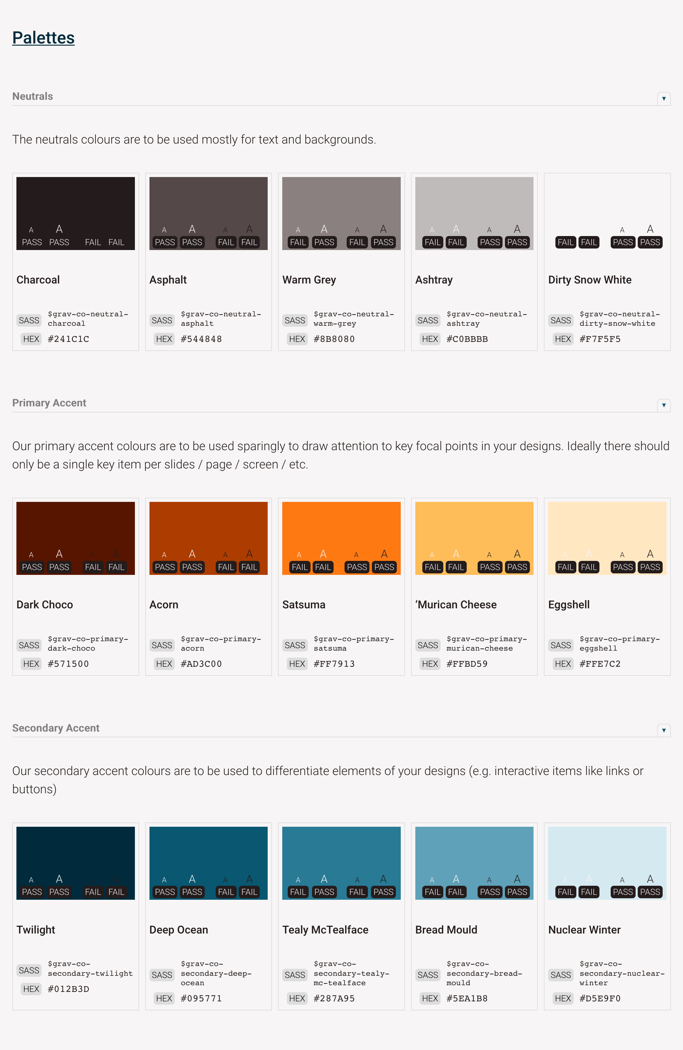
As we built the website we noticed that this caused some limitations, but so far their use has allowed all the applications we needed.
On top of this, the visual language hinted us towards a clean and clear layout, following once again the tone of voice.
Technology, platform and pipeline
As the work on UX and Brand was going on, we needed to address how the whole technical side of the website, specifically the basic technologies to use (aside from HTML, CSS, and JS), how to publish the website, how to do Continuous Integration and Continuous Deployment, with the help of Brodie McIntyre and Lorenzo Nicora.
While the possibility of having a blog, user management, dynamic sections and so on was on the plate of things we could potentially have, none of it would have been a sensible choice for an MVP, given we were currently using Medium as a blogging platform and we had no drive for any of the features we discovered: we wanted to start small, validate and iterate.
I found this quite interesting and very much relatable in relation to a lot of clients projects: the fact that you do a full blown discovery phase with prototypes, features and so on, doesn't mean that that's what your final users will need. The idea, as usual, is to get something working in the hands of your customers to get yourself started. Especially when you have so much to validate in the first place, let alone add complex new features.
As James Nash explained in his post, we had two pipelines, very much similar to each other:
- The style guide (using PatternLab)
- The website
For the first one we wanted a more stable and known merging strategy like GitFlow, that, even if it added some additional validation steps, it would also ensure we could write a proper CHANGELOG and release notes. As part of the build phase, a part of the artefact was also published over to the NPM registry.
The website instead used a proper continuous integration strategy, using only feature branches but no development branch. The staging environment was publishing the master HEAD, while production was built based on the latest semver tag. This allowed a faster iteration cycle without compromising quality.
In order to keep things as lean as possible, we decided to go for a static website, using Gulp v4 and Metalsmith with Handlebars.js as templating engine, since it would have made the transition from PatternLab much smoother, and at the same time allow us the best flexibility for any future decision, being going for a full blown CMS (ugh) or a headless solution.
From this we also wanted to see if we could do A/B testing using feature branches, which was investigated and implemented by Lorenzo which you can read about in his brilliant article A/B testing on AWS CloudFront with Lambda@Edge.
The Publication of the style guide
The publication of the style guide marked the moment we could finally work on the website.
I think it's important to highlight that publishing and maintaining a style guide is not something that should be taken lightly. For us, it was the most important step for supporting a much larger investment into Gravity design system, which meant that we had to deliver it with the final users in mind.
The ideal workflow for it was meant to be:
- Create a new UI component
- Push the code and create a PR.
- Get the PR approved (we later implemented some guidelines for that).
- On merge, publish the style guide.
- "Import" the new item into the product (in this case, the website).
- Publish the website.
There are a series of problems with this approach which I touched in a previous article of mine, and it might be worth spending some time describing them in a separate article, given that maintenance might be quite expensive.
All considered, I think this to be the most flexible flow, considering our architecture is pure HTML, CSS, and JS, without any particular framework in the picture. It could also allow expansion and automation for making step 5 more seamless, and with the introduction of some techniques and adjustments we could ease some of the other steps and remove overhead.
We also couldn't predict what the future will be like, what other projects will be using, so this set up was to keep the number of dependencies for the style guide as low as possible.
Delivering the MVP
We started the work on the actual website with a workshop on content strategy which helped us understand what we wanted, how we wanted and whether it made sense in the grand scheme of things.
We also knew that once we would have started working on the actual website, we would have needed to do some adjustments, specifically with some of the graphic elements that were currently missing. Not only, a lot of the solutions we came up with were mostly ideas, that might not have worked.
For this reason we decided to aim for two internal user testing session, to - once again, validate our work so far, before releasing it to the public:
- The first one was meant to be a rapid high-fidelity prototype to help us understand if the look and feel we decided to go with, was received positively by some key figures, and whether the content strategy made sense overall.
- The second one was instead a "before-public-release" type of user testing session. This instead was to make sure we didn't miss anything both in copy and in content. The user testing session would have been still internal but larger.
The prototype
With the first publication of the style guide, essentially comprising the brand guidelines, the design tokens and the basic HTML elements, with typography, colours, vertical rhythm sorted, we could start thinking of the website in more practical terms.
PatternLab (the tool we used for the style guide), allowed us to quickly create static prototypes to assemble the first few elements in order to get something out and test it with some users.
We wanted to have an experience that mimicked the actual website as much as possible, which was almost the opposite of the user testing session we did initially. This dragged us into two debatable situations: we had to come up with some copy, and the effort taken to build the website almost felt like building the actual website.
Coming up with quality copy has probably been the most difficult task we had to tackle. We were forced to put two brains together (thanks Zane for your help) in order to achieve something, which was essentially a re-elaboration of a lot of copy that had previously been created, and some additional things that we had to create in order to fill some gaps.
If I were to go through this again, in any case or scenario, I would get a professional copywriter well in advance, with the only clause to be someone that is used to work on the web. Copywriting on the web requires experience in it, as it is a very peculiar type of medium that needs a good understanding of how it works.
In regards to the effort taken to build the actual prototype, the overhead was not particularly significant, but given the development cycle for the components in PatternLab first and on the website later, meant that we had to duplicate the markup when porting it.
The user testing session, aside from understanding whether the direction in the look and feel was right (yay!), gave us the opportunity to understand what people felt like it was missing, which helped us reshuffling the backlog.
The first release
As expected the work on the website itself was more technically challenging than anything. We did have everything ready in terms of stories (or tickets), it was just a question of getting them done. There were very few things that needed to be adjusted.
The delivery was broken down in two phases: the first one was focused on getting the bare minimum to have a working site in place with everything we planned for, while the second part was to sand off the last few things we uncovered with a user testing session after the first phase was done.
Of the many things that we decided to introduce in the second phase were a few that meant having a polished product that was ready for prime time, and not just a raw MVP as we initially aimed for. For instance, we did introduce some flares for decoration purpose of the website, a more captivating hero in the homepage, and some adjustments in terms of user experience of some UI components.
But the most important part to highlight here is that all the development was done with performance and quality in mind, from the ground up: having proper semantic structure of the markup, using a pattern library and a design system, working with pure ES6 for the few functions we needed, was all part of a strategy to disseminate quality throughout the whole work. The result of this was incredible, and it meant that very little was left to be done.
Post-delivery and some final notes
This has been a journey that lasted a bit more than 5 months.
Yes, we just wanted to create a new website, but not just like anyone else. And I think we managed to achieve this. We set an example of the way to work that has no precedents, we had the ability to inspire and elevate our knowledge.
During this time I had the opportunity to meet and share ideas and collaborate with some great people, which I will miss.
This is something I will continue to look back at with pride.
Thank you all.